Layering Pastels Without the Mud: How to Keep Pastel Colors Vibrant
- Kate Shaner
- Jul 23, 2025
- 5 min read
If you’ve ever started a pastel piece with a glowing color palette only to end up with something dull and murky… you’re not alone. Muddy colors are a common frustration for pastel artists—especially when you’re layering without a clear plan. But good news: there are ways to build rich, dimensional color while keeping that luminous vibe alive.
Let’s talk about intentional layering, how to avoid over blending, and how to keep your pastel colors singing instead of smearing.

1. Layering Pastels: Understand Your Surface
Your paper is the foundation of your entire piece—and when it comes to pastels, the surface you choose can make or break your results.
The key thing to know is this: pastels need tooth. Tooth refers to the texture of the paper—the tiny bumps and grooves that grab onto the pigment. Without enough texture, the pastel just kind of skates across the surface. It might look okay for one or two layers, but try to build more—and it turns to mush. The colors slide around, mix unintentionally, and lose that vibrant, layered look that makes pastel work so magical.
There are a few main types of surfaces you’ll come across:
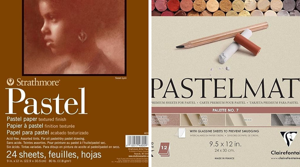
Sanded Papers (like UART, Pastelmat, or Art Spectrum)
These feel slightly gritty to the touch—almost like fine sandpaper—and they can hold many layers of pastel. This makes them ideal for building depth, experimenting with bold color, or working in both soft and detailed areas. They also handle fixative well and won’t warp as easily.
Toned or Textured Drawing Papers (like Canson Mi-Teintes)
These have a gentle texture—enough to hold a few layers of pastel but not as much as sanded paper. They’re great for beginners, quick sketches, or lighter applications. Many come in beautiful muted colors that can give your piece an instant mood or underpainting base.
Pastel Boards or Primed Surfaces
Some artists apply a clear pastel ground (like Golden Pastel Ground) onto watercolor paper, wood panels, or canvas. This gives a customizable tooth that works with both oil and soft pastels, letting you choose your own surface and scale.
Choosing the right paper is like picking the perfect dance partner for your pastels. Once you find a combo that works, the rest of the process becomes smoother—and way more fun.
Before you dive into a full piece, always do a little test in the corner of your surface. Try layering two or three colors. See how the paper reacts—does it still hold pigment after a few layers, or does it start to repel or smear? Getting to know your surface can save you frustration later on.
2. Use Color Theory to Your Advantage
When working with pastels, color isn’t just about what you choose—it’s about how you use it. Especially when layering, understanding a few key color theory principles can help you avoid muddy results and create more vibrant, intentional artwork.
Complementary Colors = Drama (But Handle with Care)
Complementary colors are colors that sit directly across from each other on the color wheel—like red and green, blue and orange, or yellow and purple. These combos can create striking contrast and vibrant tension if used wisely. But when layered or blended directly together, they often neutralize each other—turning your bright colors into brown or gray mush.
Try placing complementary colors next to each other rather than on top of each other. If you do layer them, go slowly and use a light touch.
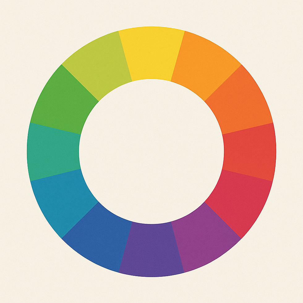
Analogous Colors = Smooth Blends and Harmony
Analogous colors are neighbors on the color wheel—like blue, blue-green, and green, or red, red-orange, and orange. These colors naturally “get along” and are perfect for soft gradients or mood-driven pieces. They blend smoothly, layer nicely, and rarely cause muddy surprises. If you’re new to pastels or working loosely, start with analogous palettes to keep your results clean and cohesive.
Warm vs. Cool Tones = Emotional Impact + Clarity
Every color leans warm (think sunlight and fire) or cool (think sky and shadows). For example:
Warm red = orangey, like tomato
Cool red = pinkish, like magenta
Warm green = olive or lime
Cool green = teal or mint
Mixing warm and cool tones without planning can lead to dullness or color clash. A warm red mixed into a cool green can create a neutral brown that lacks vibrancy. But if you stay within the same temperature range, your layers will feel clearer and more intentional.
3. Control Your Pressure
Layering isn’t just about what you apply—it’s how you apply it. Heavy pressure too soon can crush the texture of your paper and flatten the pigments into mud. Lighter, intentional layers let you build color slowly and keep things vibrant.
Try this exercise: create a gradient using just one color, applying it in three different pressure levels. You’ll notice how heavy-handed blending can dull the pigment, while feather-light layering keeps it fresh and dynamic.
Watch out: Once the tooth is filled, no amount of layering will bring vibrancy back. That’s when muddy chaos tends to sneak in. You can sometimes remove pastel with tools like kneadable erasers, but this can be a difficult process.
Let Your Layers Settle
One of the most overlooked steps in pastel work—especially for beginners—is pausing between layers.
Oil Pastels: Give Them Time to Set
Oil pastels don’t fully “dry” like paint, but they do firm up over time as the oils stabilize. This is especially important if you’re planning to layer lighter colors over darker ones, or add fine details. Some brands (like Holbein) set up faster and feel less greasy, while others (like Sennelier) stay soft and creamy much longer.
If you apply another layer too soon, especially with a heavy hand, the colors can mush together and lose their vibrancy or texture. Letting them sit—even for just 10–20 minutes—can help keep your layers clean and defined.
Soft Pastels: Powder That Needs Patience
Soft pastels behave differently. They leave a dry, dusty layer of pigment on the surface, especially on papers with a lot of tooth. If you go in immediately with more pastel, you can easily lift or mix the pigment in a way that turns it muddy. Waiting just a little can allow the particles to “settle” into the paper fibers a bit more, giving your next layer something more stable to grip.
What About Fixative?
If you’re using a fixative to seal a layer before moving on, keep a few things in mind:
Fixatives can alter your work. Most will darken your colors slightly or change the surface texture—some make the paper feel slicker or more absorbent.
Use in light layers. A light, even mist from 10–12 inches away is better than saturating the surface.
Let it dry completely. Even if it looks dry, give it 5–10 minutes (or longer in humid conditions) before continuing.
By taking a pause between layers, you’re giving your materials time to breathe. That little bit of patience can protect your color clarity, preserve your texture, and help you avoid the dreaded pastel “mud.”
5. Let the Viewer Do Some Work
Here’s a secret: You don’t have to say everything. A few strategic details can suggest the rest—and that suggestion can be way more powerful than spelling out every blade of grass or facial line.
Leave some areas loose or gestural, especially in the background or edges of the composition. It gives your piece energy—and lets the viewer’s eye and imagination complete the story.
Knowing when to stop isn’t about giving up. It’s about trusting yourself and the story your art is telling. Sometimes, the most confident thing you can do is step back—and let the work speak for itself.
Wrap-Up: Less Is More (Seriously)
Layering with pastels is part science, part intuition. And while muddy moments happen, the best way to avoid them is to slow down, plan ahead, and trust your eye. Use surfaces that support your style. Build color intentionally. Know when to stop. Most of all? Experiment. Your next breakthrough might come from a mistake—and that’s part of the magic.


Comments